Rebuilding the Associate Production view in Command — and shipping the platform's first generative AI surface alongside it.
Command is Keller Williams proprietary operating system: the software that runs the day-to-day of every market center in the network. Inside Command, Market Center Leaders and Tech Trainers spend a significant part of their week on one screen in particular: the Associate Details page. It’s where they understand how an individual agent is performing, decide who needs coaching, and figure out who might be at risk of leaving.
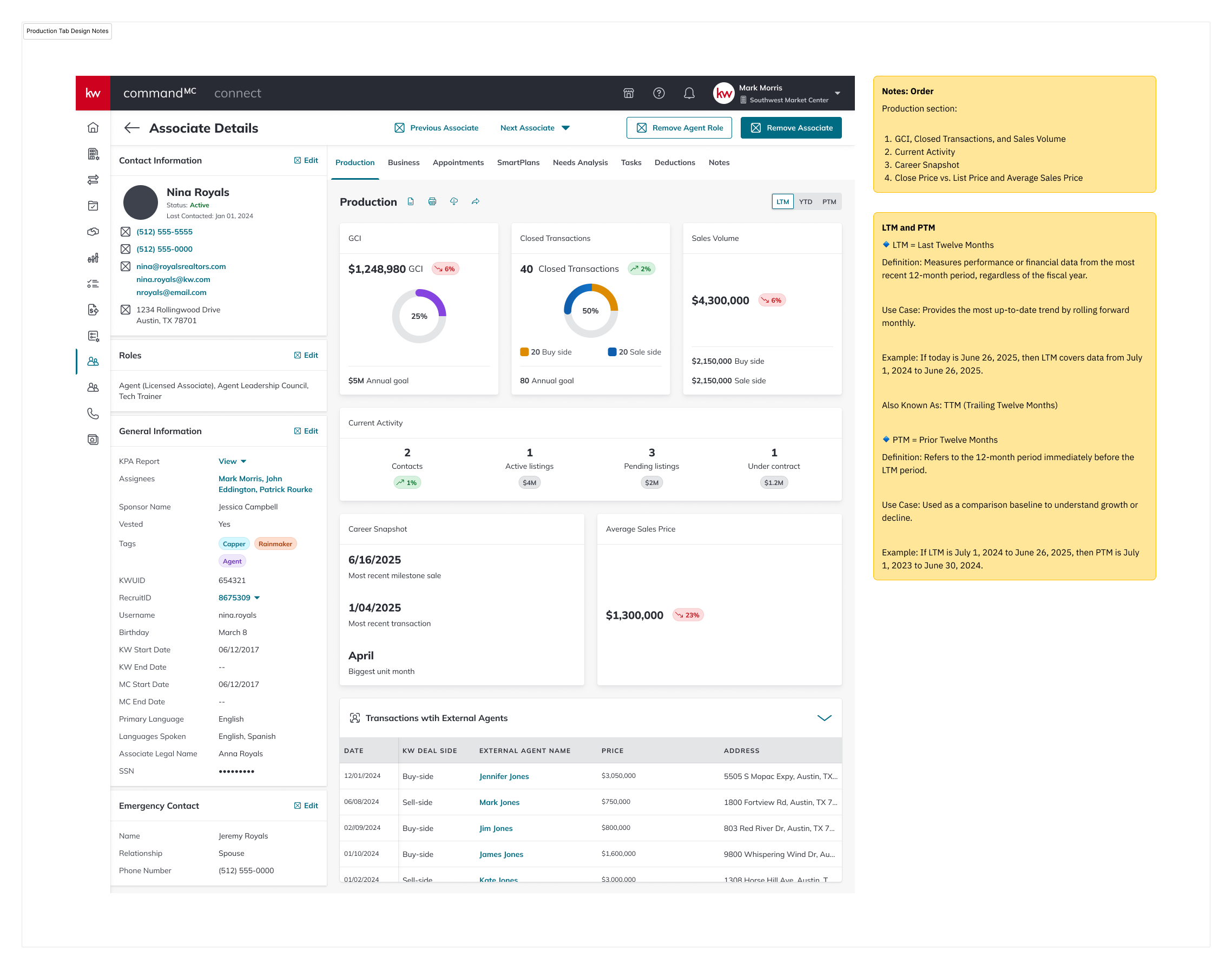
The Production tab inside that page was the screen doing the heaviest lifting, and it wasn't holding up. Leaders couldn't tell at a glance who was trending up or down. They couldn’t see who needed a call this week. The data was scattered, static, and hard to read.
I was the sole designer on this project, working end-to-end from research through hi-fi specs, responsive breakpoints, and the full matrix of error and empty states. Equally important, I designed the applets first generative AI surface inside this same tab — an AI-Powered Insights module that turns raw agent data into coaching prompts a leader can actually act on.
Three things were breaking down for leaders in the existing view:
No view of at-risk agents. Current numbers were there; trajectory wasn’t. An agent could be quietly sliding for two quarters and nothing on the screen would tell you.
Outdated and hard to read. Dense tables, inconsistent hierarchy, and metrics that required mental math. Leaders would open the tab, look for a few seconds, then go ask someone what was actually going on.
No visibility into trends. Year-to-date was the only window, which was lagging and arbitrary, especially in February.
I anchored the redesign on a single question: "Can a leader open this tab, spend fifteen seconds on it, and walk out knowing what to do next?"
That pushed me toward three parallel work-streams, equally weighted: restructuring the Production data so trajectory, not totals, was the star; designing an AI-Powered Insights module that turned that data into coaching prompts; and building the states: errors, empty, loading, and responsive breakpoints; because a tool leaders rely on needs to be trustworthy when things break.
A redesigned Production tab where comparative time windows make trajectory visible at a glance, and an AI Insights module surfaces specific, inspectable coaching prompts. Structured feedback affordances: reload, share, structured reasons + free text: make the AI output legible to the model team and the designer alike.
The redesign has shipped. Adoption metrics are still landing, so this case study focuses on the decisions, not the dashboard numbers.
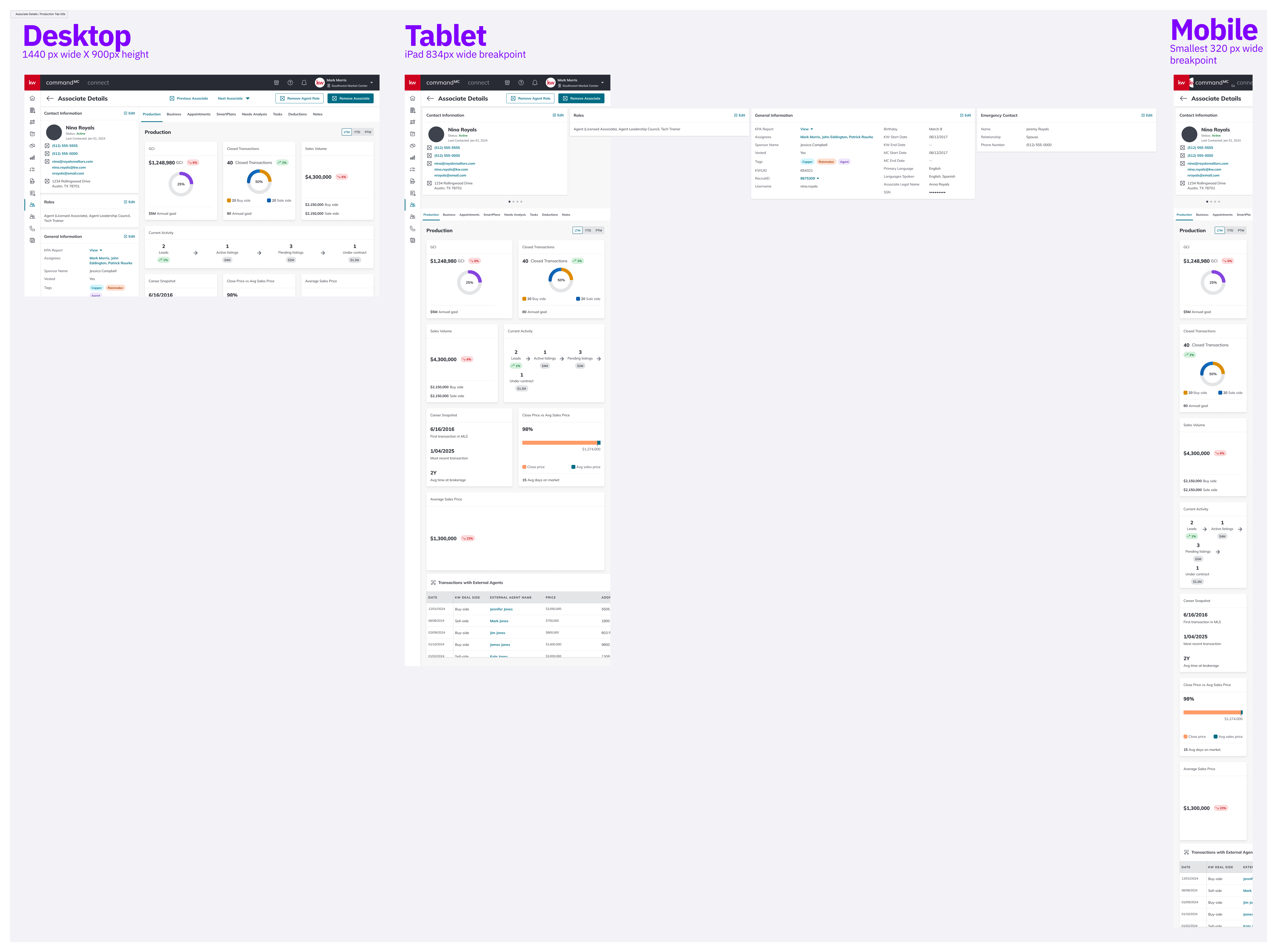
Three breakpoints, designed in parallel: Desktop 1440 × 900, Tablet 834 (iPad), Mobile 320. Tablet got real attention; leaders use them during market center walkthroughs, not as a scaled-down desktop.
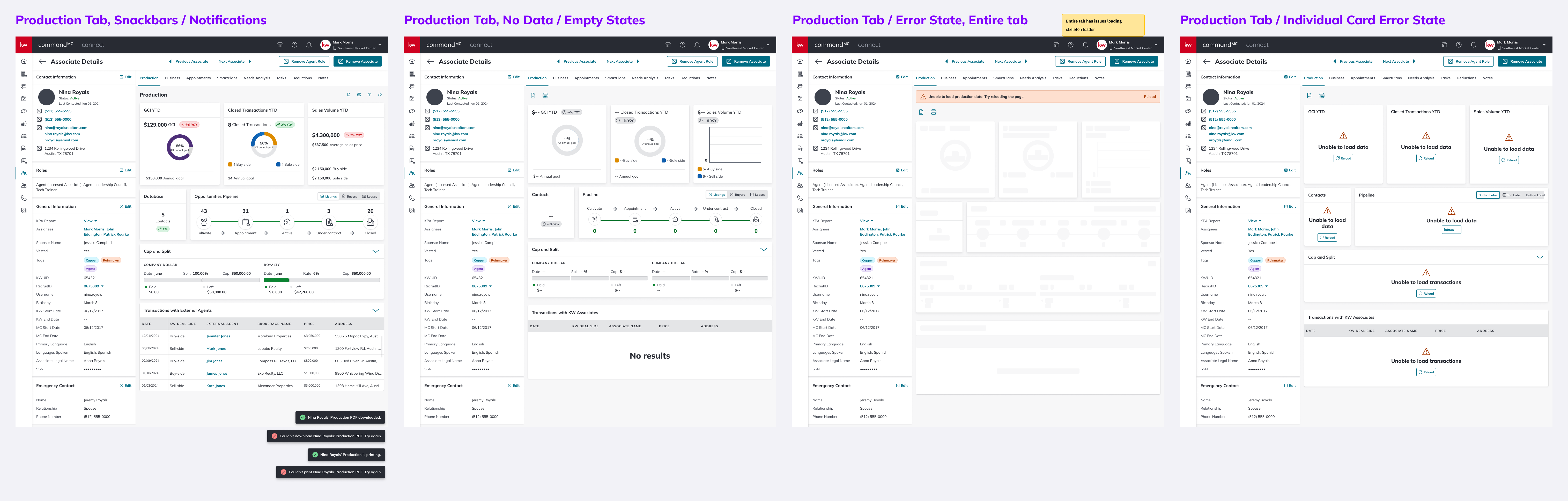
A tool leaders rely on weekly needs to be trustworthy when things break. Snackbars (PDF download / print, success and failure), empty states, full-tab errors with skeleton loaders, and per-card error states, each with its own designed path.
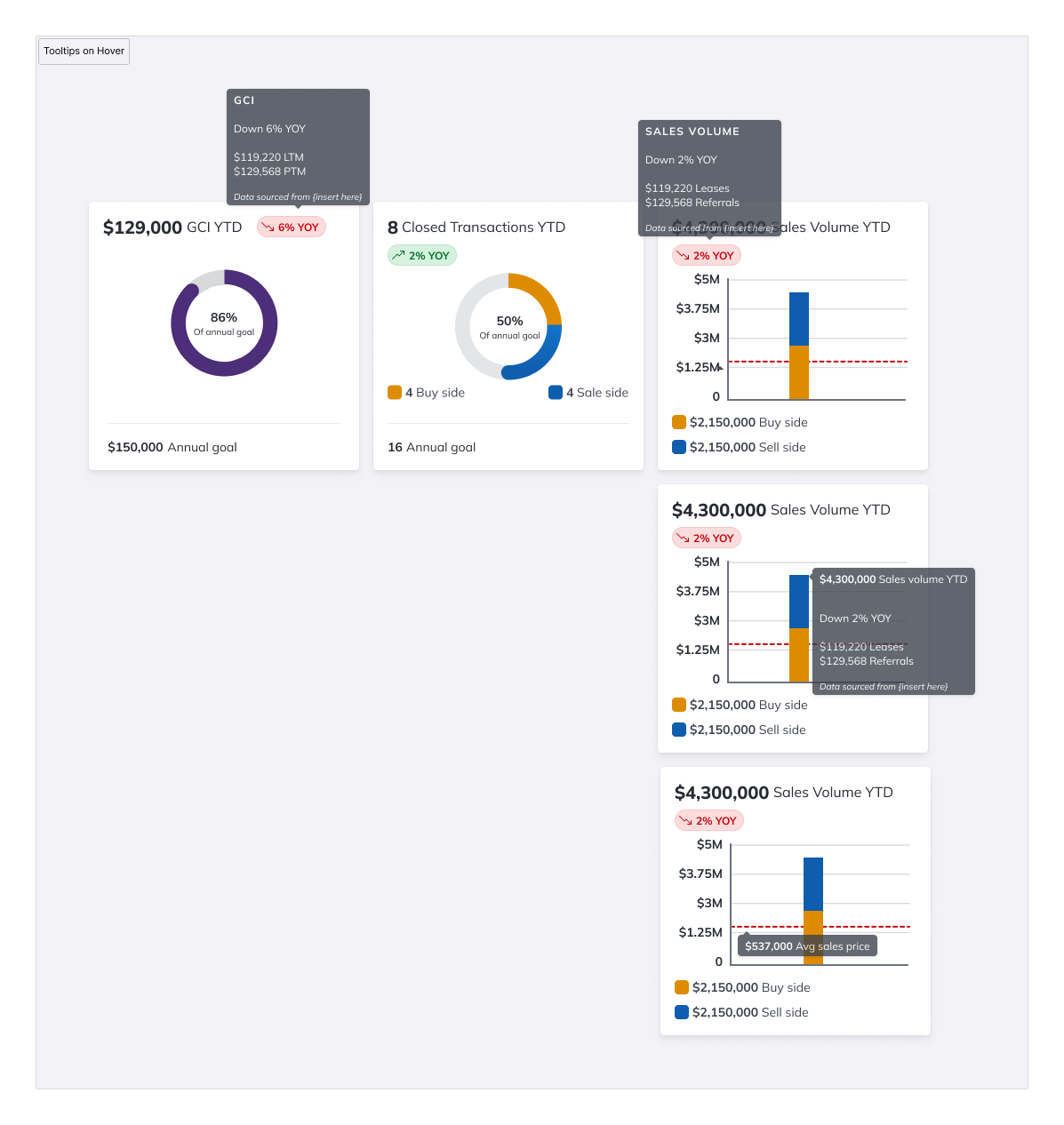
Added after mid-July 2025 user synthesis. Users wanted the underlying LTM vs. PTM numbers without leaving the tab. Tooltips surface the comparison without adding visual noise to the default state.
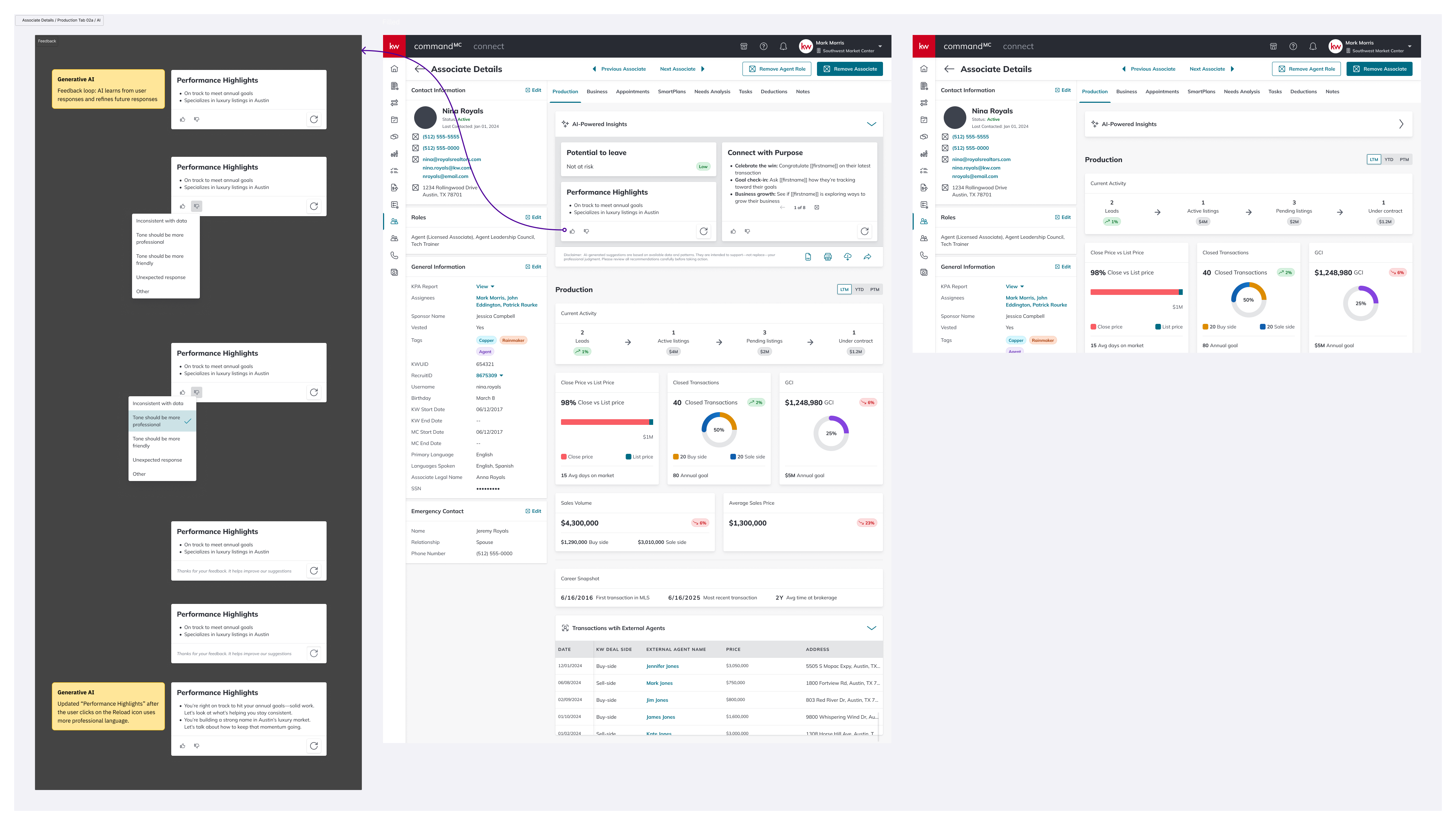
The first generative AI surface on the platform. Reload, share, and structured feedback (with "Other" + free text) make the module legible to leaders using it, and to the team improving the prompts behind it.
The tab ships across three breakpoints. Desktop — 1440 × 900, the primary target. Tablet — 834px wide, with cards reflowing into a two-column grid and the pipeline visualization staying full-width. Mobile — 320px wide, everything stacked single-column; the pipeline scrolls horizontally rather than truncating.
Leaders use tablets in the field during market center walkthroughs, so the tablet layout got real attention.
A synthesis pass with users in mid-July 2025 produced three changes:
Tooltips on metric cards — users wanted underlying LTM vs PTM numbers without leaving the tab.
A dedicated Open Opportunities view — leaders were conflating "people in the database" with "people currently in a deal." The redesign splits these into two surfaces.
Toast refinements — distinguishing "is printing" from "printed," and "download started" from "download complete."
Tab engagement time — does the new version hold leaders' attention for less time (good, faster) or more (also potentially good, more to act on)? Qualitative context separates them.
AI card interaction rate — are leaders using reload, feedback, and share, or are the AI cards decorative?
Feedback signal quality — if "inconsistent with data" dominates, that's a model problem. If "tone" dominates, that's a prompt problem. The design makes those failure modes legible.
Push harder on pipeline density. The Opportunities Pipeline weights each stage equally, but a bottleneck at "Appointment → Active" is a different problem than at "Under Contract → Closed." A future iteration would draw the eye to where drop-off is worst.
The AI feedback taxonomy is a v1. "Tone should be more professional / more friendly" are the right first cuts, but real usage will surface reasons I didn't anticipate. The "Other" free-text option is there partly so I can learn what I missed.
Mobile needs a real user test. Team Leads don't typically open Command on a phone: if data shows mobile use is rare, that breakpoint may be over-engineered.
Designing inside a proprietary platform like Command is a particular kind of work. You’re not trying to win new users. The users are already here, and they’re going to use the thing whether it’s great or not. That changes the job. Great isn’t about acquisition; it’s about whether the tool earns its place in someone’s day.
The Production tab is a tool Market Center Leaders open several times a week to make decisions about real people's careers. The goal of the redesign wasn’t to make it prettier. It was to make a leader feel, every time they opened it, that it was on their side: that it respected their time, surfaced what mattered, and didn’t pretend to know more than it did.
That’s the kind of product design work I want to keep doing.