Design a native homeowner ecosystem and vendor marketplace that creates a new revenue stream for agents beyond traditional commissions. Two interconnected products: Keller Home for consumers — home valuation, equity tracking, and agent connection. Keller Home Pro for vendors — job management, leads, scheduling, invoicing, and payments. The two surfaces had to feel like one cohesive system across both sides of every transaction.
Synthesize three interconnected user experiences — homeowner, vendor, and agent — into a unified proof-of-concept to secure funding, while solving for the $17,000 loss sellers face from incomplete home maintenance. Consumer and vendor mental models don't overlap; a vendor bidding on a job sees different data than the homeowner posting it. Legacy APIs surfaced raw transactional states in the UI rather than user-friendly language.
Co-led cross-functional whiteboard sessions with product leadership and a team of 35 engineers to design end-to-end vendor workflows from onboarding to invoicing. Mapped the full job lifecycle with PMs before opening Figma. Co-designed a shared component library with iOS, Android, and web pods using strict atomic naming conventions. Ran usability sessions with real vendors and homeowners to validate task flows before each release.
Secured $16M in funding and unlocked a projected $1.5B annual revenue stream by scaling the prototype into a full MVP development effort. Shipped consumer-facing home valuation and equity tools, sign-up onboarding, and agent connection — alongside the full vendor lifecycle from lead intake through invoicing. Component library reused across both apps without rework. Dual-sided design pattern formalized as a reusable framework for KW.
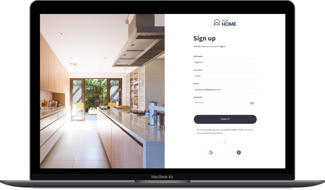
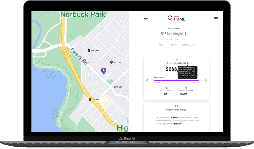
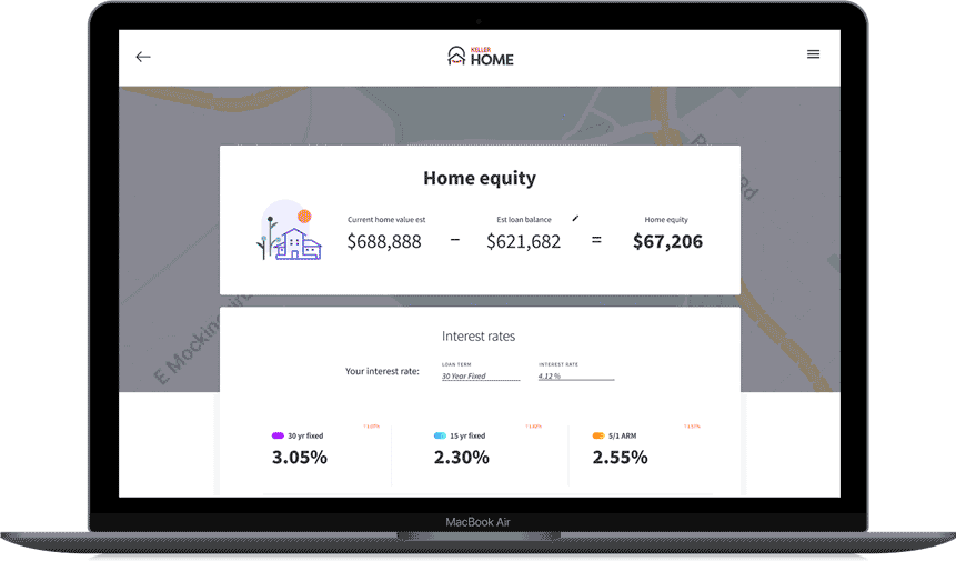
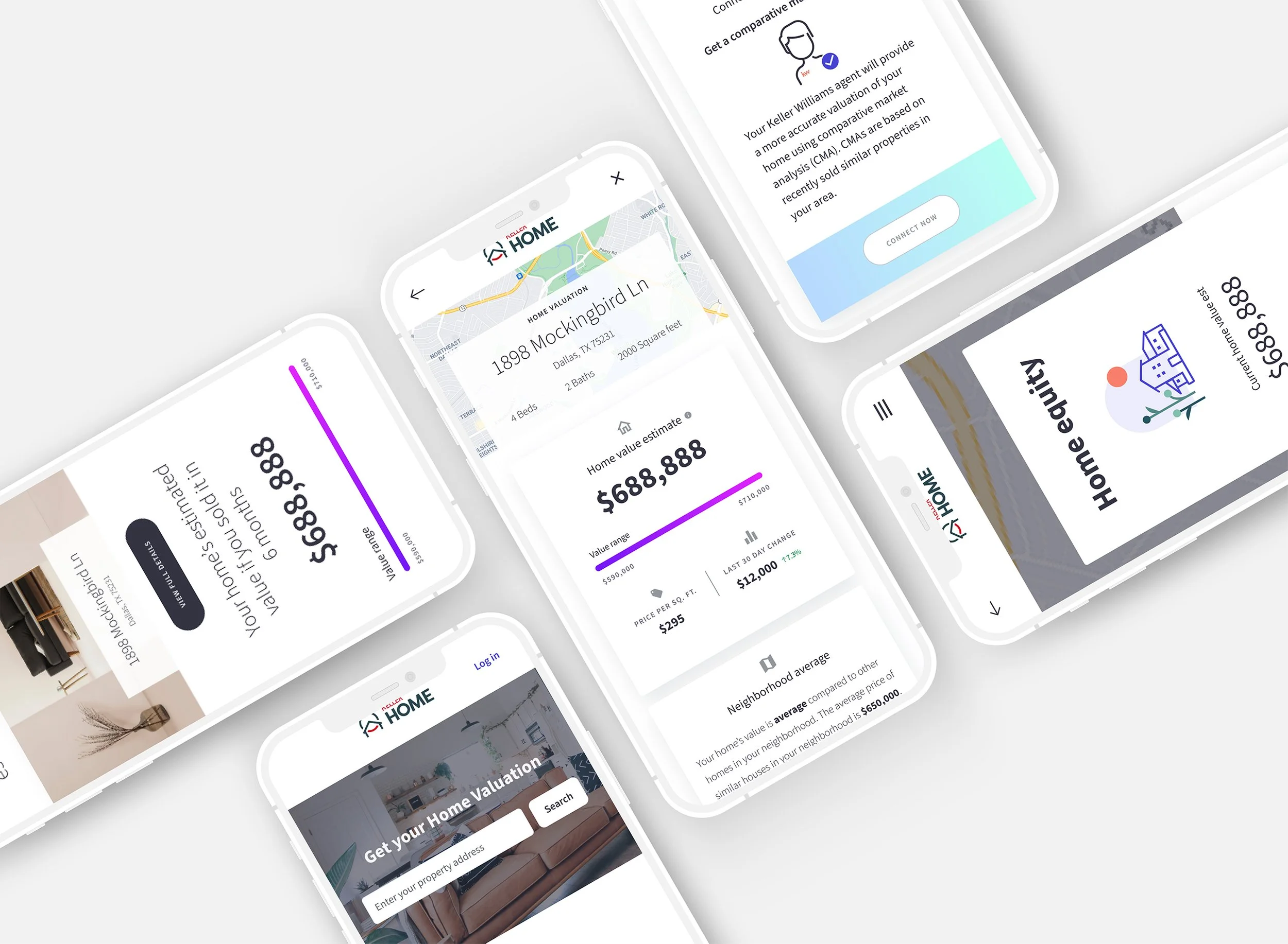
Sign-up → Home Valuation → Home Equity. Three core surfaces of the consumer app, shown at desktop. Plain-language copy replaces raw API states; trust signals surface inline at decision points; the equity tool ties live home value to current rate ladders so the homeowner can act, not just observe.
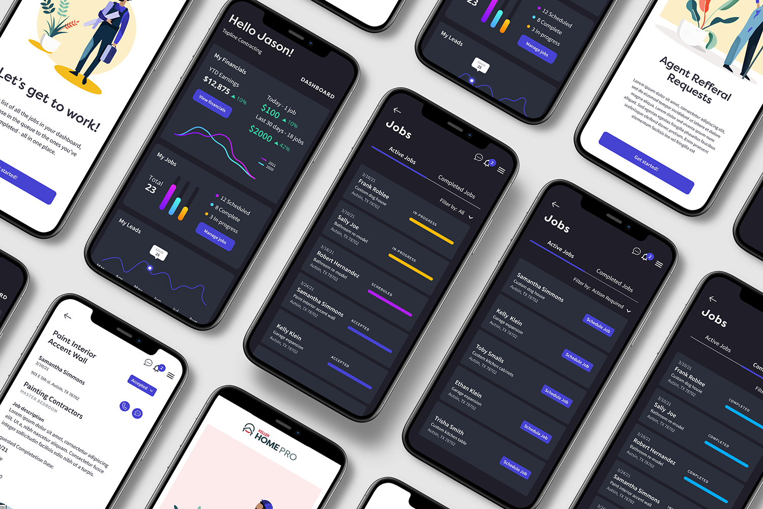
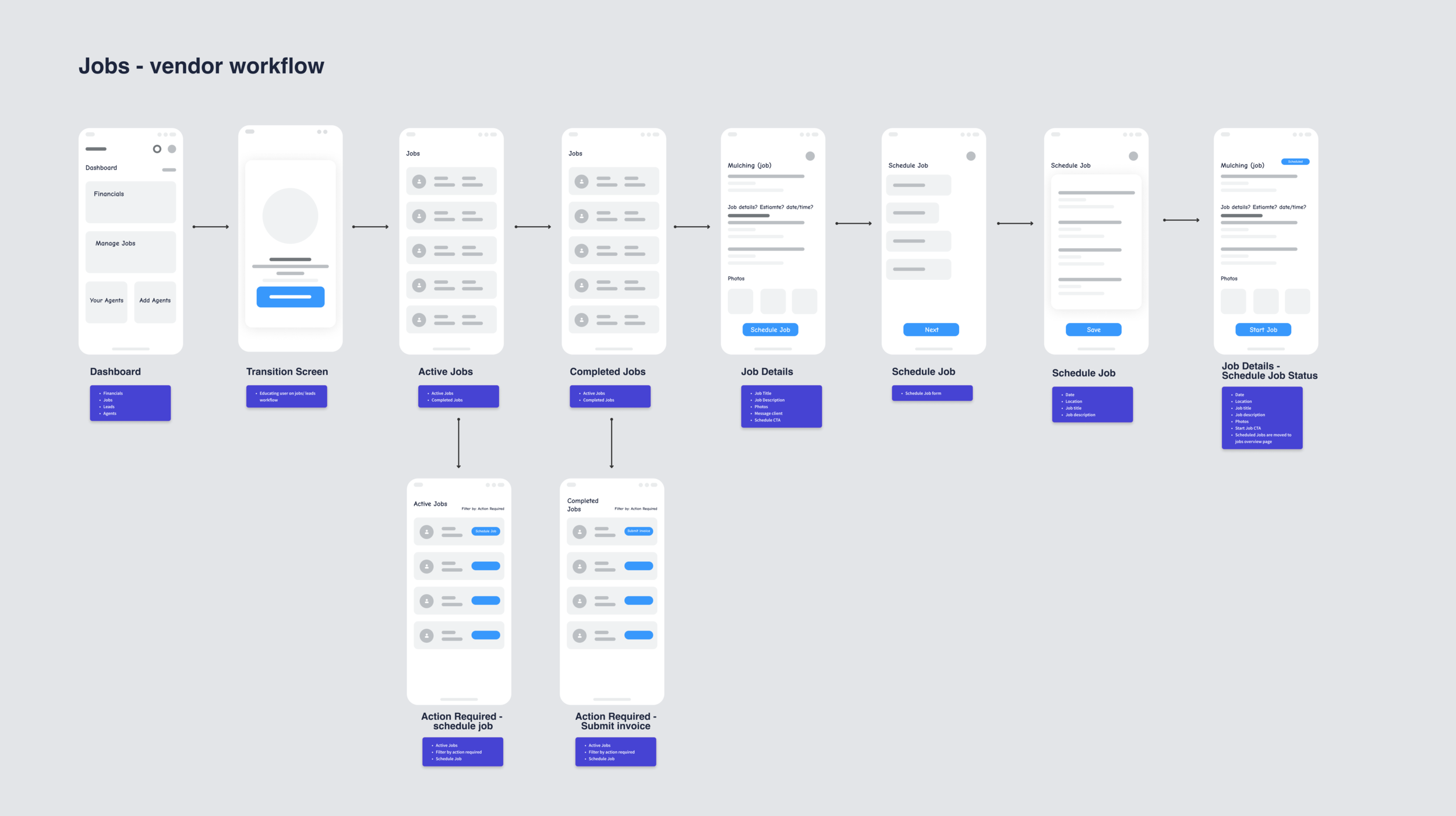
Vendor manage view — active jobs, scheduling, and quick-action workflows. Designed for one-handed mobile use during on-site work.
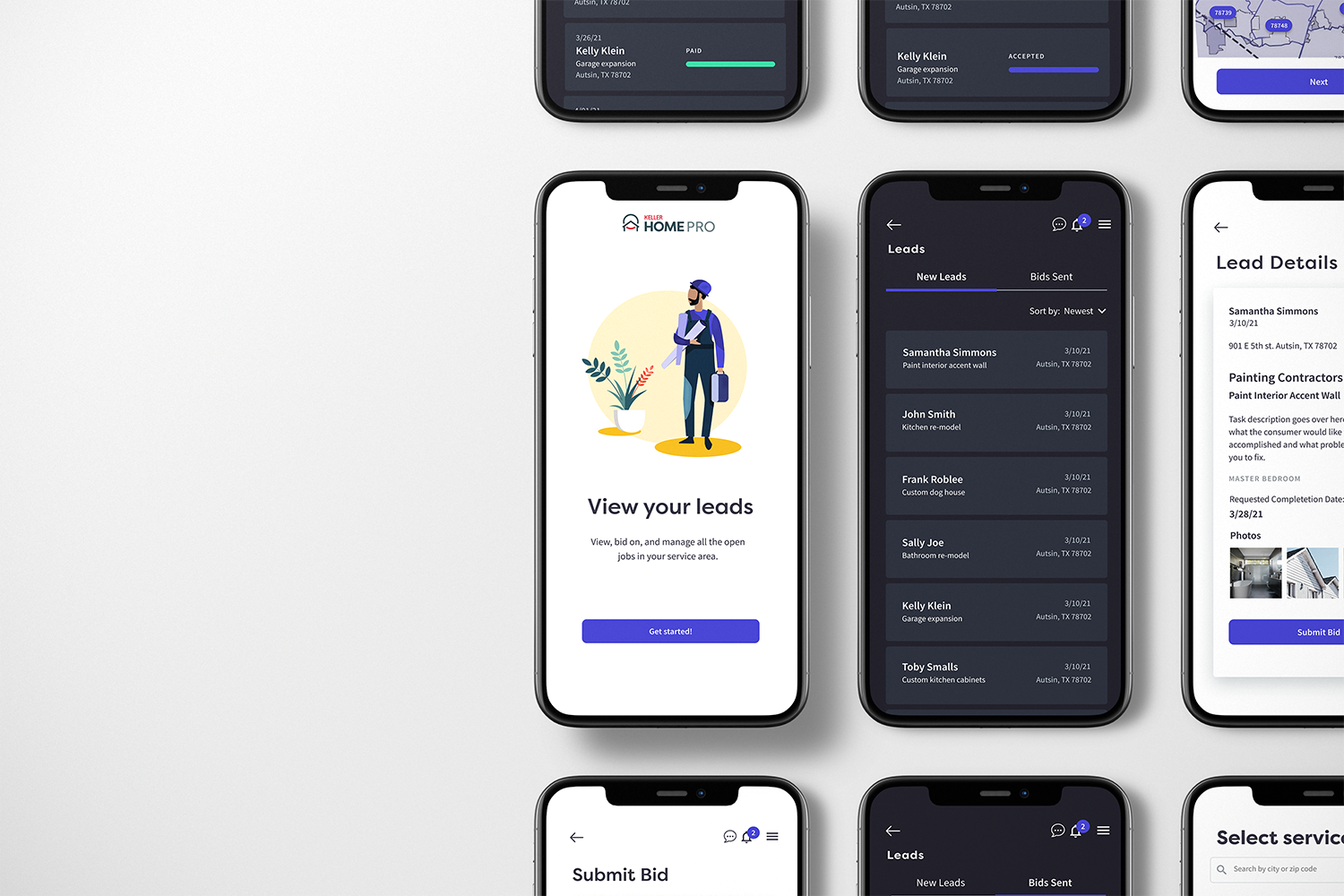
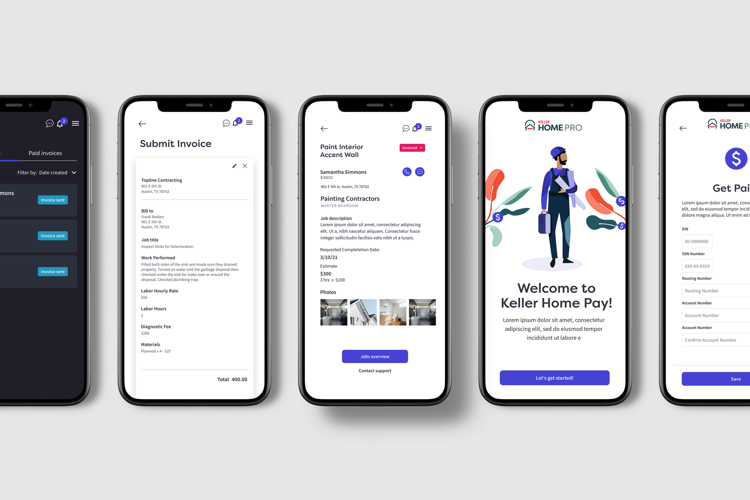
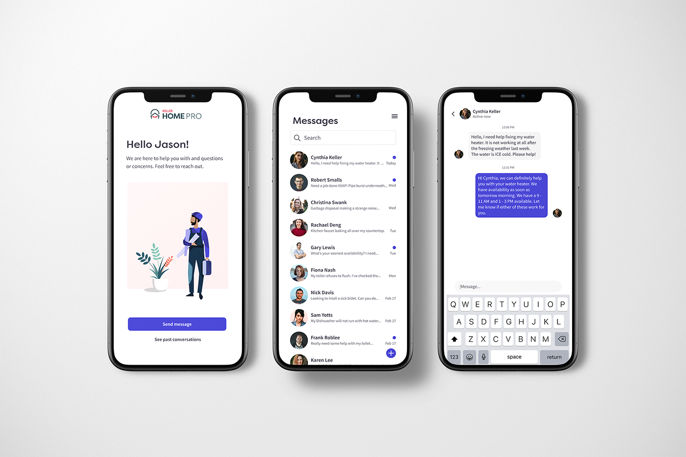
Leads → Invoicing → Communication. Three pillars of the vendor lifecycle, unified under one component system.
Low-fidelity wireframes from the discovery phase. Validated information architecture before pixel-level decisions.
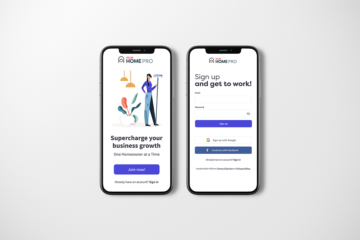
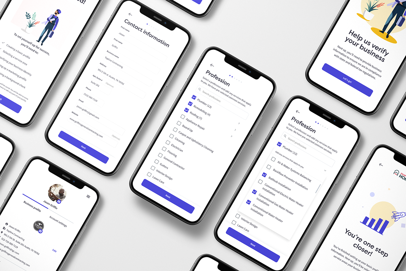
Vendor acquisition landing page and first-run onboarding. Conversion design supporting the product launch.
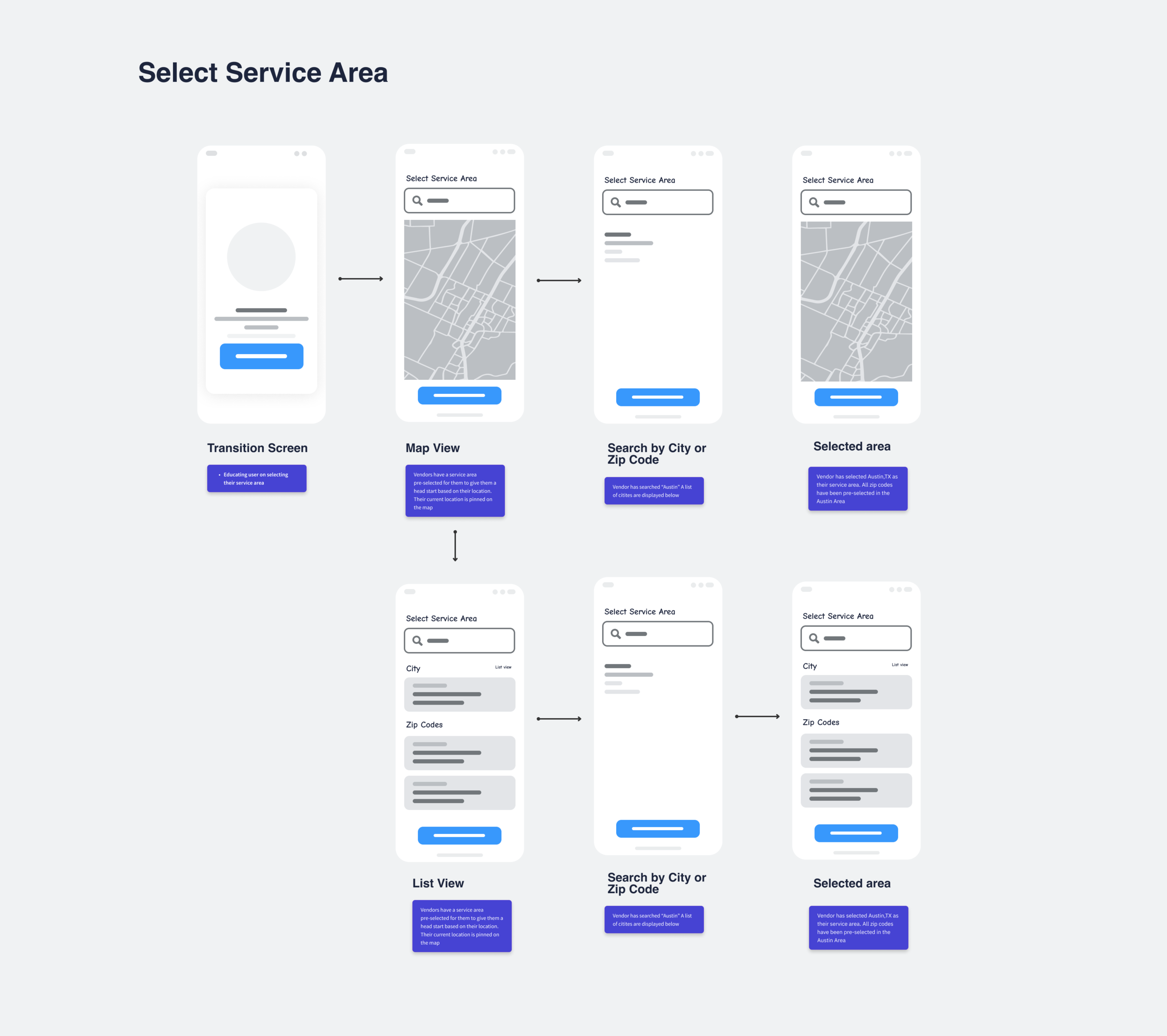
Before any UI work, mapped the full job lifecycle across both user types — request, bid, schedule, complete, invoice, pay. Surfaced 12 hand-off points where consumer and vendor data needed to stay in sync.
Built one shared component library, then themed it per surface. Vendor app emphasized data density and quick action; consumer app emphasized clarity and reassurance. Same primitives, different defaults.
Worked with iOS, Android, and web teams in parallel. Documented platform-specific deviations explicitly so engineers didn't have to interpret. Reduced design clarification questions during sprints.
Hallway tests with real KW vendors and homeowners. Maze for evaluative tasks. Findings directly fed back into the component library — bad patterns were removed at the system level, not just at the screen.